 This week's theme for Illustration Friday is "Metropolitan".
Definition: Of, relating to, or characteristic of a major city
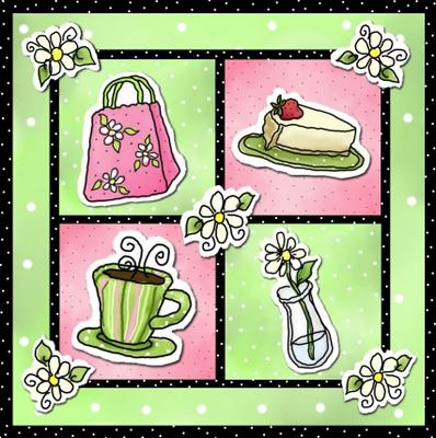
I perhaps made a bit of a stretch with my take on the metropolitan theme this week. I wanted to "zoom in" a bit down to the more intimate level of the big city - so I did images from a sidewalk cafe. This is a favorite setting for dessert and coffee with friends after a hard day of shopping in the city. I also went digital this week using Painter to get the desired, more loose look and the cut-out layered effect of the picture elements. (click here to see larger image). Although I was initially quite stumped as to how to proceed with this week's theme, I really enjoyed the process once I settled on my idea.

I love this! Esp. the 3-D quality and the color combinations.
ReplyDeletenice idea and illustration. i love the colors you used.
ReplyDeleteoh this is great! I also love the color combinations.. GreatIllo!
ReplyDeleteThe colors work so well to give it a bright spring effect and I really likd the white around the objects to give that cut out look. It has a very uplifting feel.
ReplyDeleteI love it. Love the perky colors! Just discovered your blog a few days ago and love reading it.
ReplyDeleteNot a stretch at all...your concept and your illustration are equally delightful.
ReplyDeleteI agree. Love the colors, your style here, and your solution to the IF subject this week. Good job, Becky!
ReplyDeleteVery Sweet, I love the colors.
ReplyDeleteI love it! Great take on the Metropolitan idea...very creative.
ReplyDeleteLooks like a design that should be on the sign of that coffee shop in the city..."Metro Moments".
I have an urge for cake now!
ReplyDeletelovely depiction for this week's theme, Bee! I, too, love some coffee after a hard day of shopping. Great colors and "close up"
ReplyDeletecool colors! mmm..*-* i wanna a pay..yuuuum
ReplyDeleteBana
http://larvayyo.blogspot.com
I really thought you had cut these out! This is a great take on the theme and has an intimate feel, but mostly I reckon these should be on coasters in a coffee shop somewhere uptown!
ReplyDeleteBeautiful! I would totally buy this if it were a card!
ReplyDeleteGreat, and different than the buildings most of us has illustrated. The cup is my favourite. I love it.
ReplyDeletewynlen
wynleDesign
It is awesome. I love it.
ReplyDelete